Have you ever pondered how some websites or apps look exceptionally organized, easy to navigate, and appealing to the eye, while others appear chaotic and confusing? Might there be a hidden science behind the seamless user experience of your favorite digital platforms? The unseen hero at play here is ‘visual hierarchy,’ a foundation of design principles that guides users effortlessly through content by dictating what to notice, in what order, and where to focus.
Key Takeaways
- Visual hierarchy is the bedrock ordering principle of design that creates a satisfying user experience.
- Good application of design principles is the secret sauce behind captivating and effective digital platforms.
- Visual hierarchy can make content more digestible, give guidance on where to direct attention and influence the order of consumption.
- A well-implemented visual hierarchy can enhance the aesthetics of a design, facilitating better user engagement.
- This article aims to delve into the principles of visual hierarchy, exploring its role and importance in creating user-centered designs.
Understanding Visual Hierarchy in Design
In the world of graphic design, the organization of content is a crucial aspect. One might wonder how we perceive a design and interact with it depends on so many intricate factors. Among these, visual hierarchy stands as a powerful tool that dictates the path our eyes traverse when we look at a design. In this section, we will delve deeper into understanding visual hierarchy and its significance in the realm of design.
Defining Visual Hierarchy and Its Importance
Visual hierarchy can be defined as the arrangement of design elements in a way that indicates their order of significance. It’s the principles and techniques used to guide the viewer’s eye across the design. For instance, larger, bolder elements are perceived as more important than smaller, lighter ones. The orchestration of these elements into a harmonious layout is known as content organization.
In graphic design, visual hierarchy helps in prioritizing information and guiding viewers towards specific actions, hence seamlessly codifying complexity. Effective implementation of visual hierarchy contributes to a well-structured, balanced, and intuitive design that resonates well with the audience, ultimately serving the purpose the design was intended for.
The Psychology Behind Visual Perception and Attention
Our brain works in fascinating ways when it comes to visual perception and attention. Subconsciously, it assigns different levels of importance to visual stimuli based on certain cues. Elements that stand out from their surroundings, such as those with high contrast or unique shapes, tend to capture our attention more. This is where design principles and visual hierarchy come into play.
For instance, a larger font size can help a text to stand out, making it more likely to be read first. Similarly, our eyes are naturally drawn to high-contrast areas, and using color effectively can guide attention towards certain elements while also setting the mood and tone of the design. Incorporating these principles effectively can amplify the impact of a design by guiding the viewer’s attention along a predetermined path.
“A designer knows he has achieved perfection not when there is nothing left to add, but when there is nothing left to take away.” – Antoine de Saint-Exupery.
In essence, understanding how visual hierarchy influences perception is a powerful asset for every designer that can greatly enhance the effectiveness of their work.
The Role of Color in Creating Effective Visual Hierarchy
In the realm of graphic and web design, color is not merely an aesthetic element. It plays a pivotal role in facilitating visual hierarchy and shaping a rewarding user experience. Deliberate uses of color can guide users’ attention, signal importance, and provide intuitive navigation cues across the design.
Color theory, a principle taught in leading design institutions, constitutes an essential knowledge foundation for any designer. It postulates that colors are not just diverse visual compounds but also have innate psychological implications. They evoke emotions, instigate actions, and imply meanings.
“Color does not add a pleasant quality to design – it reinforces it.” – Pierre Bonnard
To illustrate, let’s examine a few case studies of popular brands that leverage color to establish visual hierarchy within their designs:
- The Facebook mobile app, for example, uses a consistent blue and white color scheme for clarity and memorability. The blue serves as an accent color, used sparingly to indicate interactive elements and notifications.
- Google’s simple homepage also employs a limited color palette but adds pops of color with their vividly colored logo and bold blue “Google Search” button.
Both these examples illustrate the efficient use of color in design to direct user focus and prioritize information.
Consequently, understanding and strategically incorporating color principles into designs can dramatically enhance visual hierarchy, thereby improving the overall user experience.
Next, we will delve into the influence of typography on user experience and its role in establishing an effective visual order within a design.
Typography and Its Influence on User Experience
In the realm of visual hierarchy and design principles, typography plays a cardinal role. It holds the power to dramatically affect user experience, guiding the viewers’ attention and shaping their understanding of the content. Typography, especially in the context of web layout, is not merely about aesthetic appeal, but communication and user-friendliness too. Let’s delve deeper into the impact of typeface choices and the subtleties of text formatting that make all the difference in user experience.
Choosing the Right Fonts for Visual Impact
Design specialists have long emphasized the significant correlation between carefully selected fonts and the resultant visual impact. Typeface choices can alter the mood, deliver distinct messages, and even affect the cognitive ease with which users perceive information. In brand identities and logos – such as Coca-Cola with its signature script font and IBM with its bold, block-like letters – you can see the strategic application of fonts to generate certain associations and emotions.
Managing Text Size and Spacing for Readability
The text size and spacing are integral to web layout standards and contribute directly to the readability and appeal of online content. An ideal web layout ensures proper letter and line spacing along with suitable font size. It is essential to maintain a visual hierarchy where headers and body text are discernable yet harmonious. For instance, renowned news portals like The New York Times and The Guardian adeptly manage textual elements to facilitate reading flow and comprehension.
“Typography is the craft of endowing human language with a durable visual form.” – Robert Bringhurst, renowned typographer
- Size: Larger font sizes are typically employed for headings, distinguishing them from body text and subheadings.
- Weight: The strength or boldness of a typeface can also be used to establish hierarchy. Bold fonts often indicate importance or emphasis.
- Spacing: Appropriate use of white space around text (margins and padding) can significantly impact how content is perceived, aiding in reading comfort and comprehension.
- Line Length: Optimal line lengths contribute to improved readability, preventing reader fatigue by controlling the horizontal distance the eye must traverse while reading.
- Color: While usually an overlooked factor, color contrast between text and background significantly affects legibility.
If you look closely at how different websites handle these typographic elements, you’ll encounter a variety of design philosophies. Yet, the guiding force behind every choice is always to optimize user experience and adhere to the visual hierarchy principles. Understanding typography and its influence on user experience can empower us to create visually compelling and effective designs.
Utilizing Spacing and Layout to Guide User Focus
In all design dimensions, but particularly in fields heavily reliant on information architecture such as website development and application design, strategic uses of spacing and layout prove to be indispensable tools in guiding user focus. By effectively employing these elements, designers can intricately manipulate the visual hierarchy that ultimately shapes user interaction.
Renowned website developers have time and again emphasized best practices in information architecture, underlining the weight that both spacing and layout, hold in directing user focus. By considerably improving the overall comprehension and engagement of the users, well-planned layout configurations and judicious use of spacing can particularly boost the overall usability of a web page.
“Sound use of spacing can significantly aid in enhancing the user’s experience. It can propel navigation and help them discern the information architecture, intuitively interpreting interactive interface elements.”
These theories are not only backed by design experts but are also validated by the positive outcomes of usability tests. Observations from these tests invariably show the users’ inclination towards interfaces that skillfully capitalize on the proper balance of spacing and a clear, organized layout.
| Usability Factors | Effects on User Interaction |
|---|---|
| Spacing | Accelerates readability and comprehension while also reducing visual fatigue. |
| Layout | Influences user’s journey through the site by determining the sequence and method of information intake. |
Apart from theoretical endorsements and empirical evidence, practical instances in the form of experts’ opinions help illuminate this fact further. UI/UX designers consistently reveal how strategic decisions regarding layout and spacing can contribute to a clear and effective visual hierarchy, an essential component in maintaining user focus.
- Sufficient white space – Allows the content to breathe while making the layout appear less cluttered.
- Consistent patterns – Maintains uniformity, assisting users in understanding the layout faster.
- Clear separation of elements – Ensures that distinct sections are easily identifiable, enhancing user experience.
By bearing these strategies in mind, one can design visually appealing interfaces that offer a seamless user experience. The integration of layout, spacing and user focus into the visual hierarchy is therefore essential to crafting a compelling information architecture.
Implementation of Visual Hierarchy in Website Design
Integrating the principles of visual hierarchy in website design goes beyond creating an aesthetically pleasing web layout. It involves careful consideration of usability features, placement of multimedia elements, and strategic structuring of content which significantly contributes towards an enhanced user experience. Let’s delve deeper into the unique dynamics of visual hierarchy in website design.
Strategically Structuring Web Layout for Enhanced Usability
Design authority, Oliver Reichenstein, once said, “Web Design is 95% Typography.” This emphasizes the critical role that typography plays in making the website layout reader-friendly and enhancing usability. Right from the choice of font, size, line spacing, to placement, every element counts. Moreover, A/B design tests clearly depict the impact of varying layouts on visitor interaction, underlining the need for strategic layout structure in websites.
Incorporating Multimedia Elements Effectively
Multimedia elements, when integrated effectively, have the potential to amplify the visual hierarchy of a website. Websites like Apple, Google, and Spotify are prime examples of multimedia usage for reinforcing visual hierarchy. By combining text with relevant images, videos, or infographics, you can enhance the user’s comprehension and engagement level
Balancing these components aids in user-centered website design. This harmonious synergy reflects in high-performing websites which focus on visual hierarchy to guide users, promoting an intuitive and immersive experience.
| Element | Importance | Example |
|---|---|---|
| Typography | Enhances readability and draws user attention based on hierarchy | Google’s clean and minimalist typography |
| Web Layout | Directs information flow and user interaction | Amazon’s clearly structured product listings |
| Multimedia | Improves engagement and reinforces hierarchy | Spotify’s visually appealing album art integration |
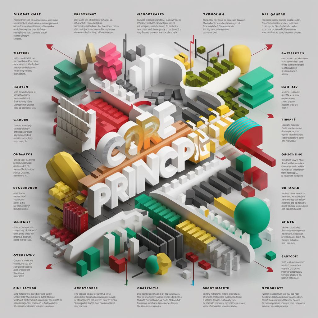
Design Principles: Building Blocks of Visual Hierarchy
In the world of design, the basic building blocks that establish solid visual hierarchy are rooted in fundamental design principles. These principles include contrast, alignment, repetition, balance, and proximity. They directly influence how content is organized and perceived, creating a compelling visual journey for the viewer.
Contrast, Alignment, and Repetition Explained
Let’s start by exploring the first three principles. Contrast drives visual interest and guides the viewer’s eyes to key areas based on differences in color, size, and shape. Alignment offers a clear and organized structure, building connections between elements. And Repetition promotes consistency, creating a cohesive look and feel that is predictable and comfortable for the eye.
These principles are best exemplified in real-life applications. Take Apple Inc.’s website for instance. It showcases clear contrast between product images and background, alignment of text and visuals for easy readability, and repetition of fonts and colours for a cohesive brand image.
“Design is not just what it looks like and feels like. Design is how it works.” – Steve Jobs
How Balance and Proximity Affect Content Organization
Moving on to balance and proximity. Balance provides stability and structure to a design, whether it’s achieved symmetrically or asymmetrically. It aligns elements in a way that evenly distributes visual weight across the composition. Proximity, on the other hand, groups related items together to make content easier to comprehend. It helps users associate similar elements and distinguishes between different sections.
Consider the popular social media platform, Facebook. It utilizes balance in its layout, placing menu items and profile pictures symmetrically for a harmonious look. Meanwhile, Facebook’s news feed exhibits proximity, grouping posts, comments, and reactions close together, enhancing understanding and convenience for the users.
To emphasize how these design principles contribute to visual hierarchy and content organization, please refer to the ensuing table.
| Design Principle | Role in Visual Hierarchy |
|---|---|
| Contrast | Draws attention and guides viewers’ focus |
| Alignment | Creates order, making designs easier to navigate |
| Repetition | Provides consistency, enhancing recognition and understanding |
| Balance | Distributes visual weight for an aesthetically appealing and stable design |
| Proximity | Aids comprehension by grouping related items together and separating unrelated ones |
All these principles are not isolated; they act together to form an interconnected system that guides the placement, appearance, and appeal of a design. As we move forward with our design journey, building a rapport with these principles would prove beneficial. By understanding and applying them effectively, we can create designs that are absorbing, navigable, and beautiful.
Visual Hierarchy: Its Impact on Information Architecture
Understanding the symbiotic relationship between visual hierarchy and information architecture is a pivotal step in carving an efficient user journey. Information architecture refers to the structuring and organization of data on digital platforms. Visual hierarchy, as has been elucidated in this article, plays a central role in conveying this organized information to the consumer effectively.
“Visual hierarchy and information architecture go hand in hand. Where the latter is concerned with devising a logical map of information, the former visually articulates this map so that users can easily navigate through it.”
Take for instance the giant that is Google. Google’s homepage is a testament to how visual hierarchy can simplify complex information systems. The search box – the core function of Google – is prominently placed at the centre of the page, clearly distinguishable by a visual hierarchy that intuitively guides the user’s attention.
This effective use of visual hierarchy in information architecture undoubtedly enhances the User Experience (UX). It streamlines the process of fetching the required information, thereby promoting user satisfaction, engagement, and potential return visits.
However, the relevance of visual hierarchy extends beyond a delightful UX. It is also a powerful tool that can be harnessed in digital marketing strategies.
- Attention-driving Designs: A well-placed call to action button can immediately catch the user’s eye and increase the likelihood of them performing the desired action.
- Improved Readability: By strategically leading the reader’s eye through a webpage, marketers can better communicate their product’s benefits or the brand’s unique selling points.
- Brand Consistency: A consistent visual hierarchy across all marketing mediums helps maintain a uniform brand perception.
A compelling visual hierarchy can indeed pave the way for a more refined and effective information architecture, enhancing user experience and optimizing digital marketing efforts. It’s indeed an integral asset in delivering intuitive, engaging designs that not only please the eye but also drive user interaction and business results.
Visual Hierarchy’s Importance in Digital Marketing
As we continue exploring the significance of visual hierarchy, it’s crucial to examine its relevance in digital marketing. While the principles of design shape the user experience, the role of visual hierarchy extends to captivating your audience’s attention, conveying compelling narratives, and ultimately converting opportunities into business success. This section highlights the instrumental part visual hierarchy plays in this digital era where attractive, digestible, and engaging content is king.
Engaging Viewers and Converting Leads Through Design
Fundamentally, digital marketing seeks to engage potential customers and convert them into active ones, and a refined visual hierarchy aids in achieving that. Case studies of successful digital marketing campaigns consistently emphasize the role of intuitive designs where the visual hierarchy guides viewers along a desired path of interaction.
“A strategic and effective visual hierarchy not only engages viewers but also seamlessly navigates them towards actionable steps, thus playing a pivotal role in lead conversion.”
How Visual Hierarchy Strengthens Brand Messaging
In addition to engagement and conversion, visual hierarchy impacts the perception of your brand messaging. Brand experts echo the concept that consistent and strategic use of design elements paints a unique brand image in the viewer’s mind and helps differentiate it from competitors.
Primarily, visual hierarchy absorbs and harnesses the chaotic nature of raw information, marshalling it into a coherent structure that appeals to the viewer aesthetically and semantically. This strategic organization elucidates the brand message, amplifying its reach and resonance with the audience.
Market trends constantly evolve, yet the significance of visual hierarchy in digital marketing remains integral, carving a unique niche within the realm of impactful visual storytelling and information sharing. The flexibility of visual hierarchy in adapting to different platforms and formats attests to its enduring relevance in digital marketing strategies.
The bottom line is that visual hierarchy, a seemingly simple design principle, can greatly enhance the efficacy of your digital marketing efforts, creating engaging viewer experiences, converting leads, and strengthening your brand messaging. Hence, it should not be overlooked in any effective marketing strategy.
Conclusion
As we’ve journeyed through the principles and practices of establishing a robust visual hierarchy, one thing is clear: visual hierarchy is not just an aspect of design — it’s the backbone. It provides direction, engages your audience, and reinforces your narrative, making your message not only memorable but also impactful. Concluding our exploration, let’s take a final look at the power of these design principles and see how you can apply them to your projects for maximum effect.
Summarizing the Power of Design Principles
Whether it’s about color, typography, or the use of spacing and multimedia elements, each design element contributes to the creation of a coherent and impactful visual hierarchy. These principles guide the user’s eyes, making interaction with your design intuitive and effortless, thereby enhancing their overall experience. From improving user experience on digital platforms to strengthening brand messaging in digital marketing, we’ve seen the transformative power of visual hierarchy in multiple domains.
Next Steps for Incorporating Visual Hierarchy in Your Projects
Applying visual hierarchy in your designs isn’t a matter of choice—it’s a strategic imperative for achieving your project’s goals. Begin by acknowledging its importance, cultivating an eye for design, and continuously experimenting with different elements. Always remember that the user should be at the center of your design decisions—aim to shape their journey through your content, influencing how they perceive and interact with it. Also, don’t underestimate the value of continuous learning and staying up-to-date with industry trends.
Taking these steps will allow you to better leverage visual hierarchy, enhancing not only the aesthetic value of your projects but also their effectiveness and the overall user experience. As we move forward, the impact and relevance of visual hierarchy can only be expected to grow. So, it’s up to you to seize this opportunity and make the most of it.